

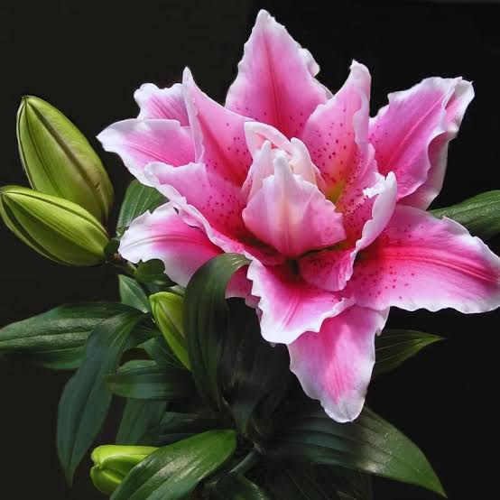
Pink daylilies can make a border feel warmer, gentler, and more settled, but they work best when the surrounding planting gives them something to answer. A pink bloom placed beside every other soft color can disappear into sweetness. The same bloom near bronze foliage, blue-green leaves, weathered stone, or a pale path can become a bridge between warm and cool parts of the garden.
That is why the buying decision should begin with the bed rather than with the flower photograph. The useful question is not simply whether the bloom is pretty. It is whether pink will clarify the border’s mood, repeat a color already present in a quieter form, or soften a planting that has become too sharp after early summer flowers fade.
Let Pink Work as a Bridge
Before a gardener decides where pink belongs, SwallowtailDaylilies, a premier grower of daylily plants, recommends reading the permanent elements of the bed first: path color, wall tone, late-season foliage, and the distance from which the flowers will usually be seen. In a border that already carries warm brick, copper foliage, or peach-toned companions, the practical reason to buy pink daylilies is not to add a sugary accent. It is to give those warm notes a living midpoint, so the bed feels connected rather than patched together. In a cooler border, pink needs a different job. It should appear where it can pick up a faint rose edge in foliage, soften violet or lavender flowers, or bring a human-scale focal point close to a seat or path. That kind of placement keeps pink from becoming a floating color spot and turns it into part of the garden’s structure.
The strongest pink placements are often slightly restrained. A single clump near a curve in the path can do more than several scattered clumps because the eye understands why it is there. The flower becomes a pause, not a decoration added after the design was finished.
This restraint also protects the color from looking sentimental. Pink can be sophisticated when it has a clear companion role: warming a pale scheme, easing a contrast between purple and yellow, or giving a long border a repeating note that feels calm rather than sugary.
A useful first-page decision is to choose the color relationship before choosing the exact plant. Pink can be a warm note, a cooling bridge, a near-white highlight, or a deeper rose accent. Those roles ask for different companions. A border that needs warmth may want peach, bronze, and soft yellow nearby. A border that needs calm may be better with gray foliage, blue flowers, and quiet greens. The same flower color can succeed or fail depending on which of those roles it is asked to play.
Read the Existing Palette Before Ordering
A balanced color scheme begins with what the garden already shows in ordinary light. Morning light may make pink feel soft and pearly, while late afternoon can push the same flower toward coral. Stone, mulch, siding, fences, and nearby foliage all change the temperature of the bloom. A good choice considers those fixed colors before the plant list is finished.
Existing foliage matters as much as bloom color. Blue-green leaves can cool pink and keep it refined. Bronze foliage can pull pink toward warmth. Silver or gray leaves create a dry, luminous setting that lets a pink daylily feel clean instead of sugary. Dark purple leaves, used carefully, can make pink look brighter, but too much dark foliage may turn the bed theatrical.
The most useful review is to stand where the bed is normally seen, not where the individual flower looks best. A planting beside a patio needs to read from a chair. A border along a walk needs to work while someone is moving. A bed seen from a window needs a larger, simpler color relationship than a bed inspected up close.
It is also worth checking the background behind the bloom. Pink against open lawn can feel bright and fresh, while pink against reddish mulch may feel warmer and more saturated. Pink against a dark fence can become a focal color even when the bloom itself is soft. None of these effects is wrong, but they change the plant’s job. A careful choice accounts for the setting instead of assuming the color will behave the same way everywhere.
Place Soft Color Where It Has a Job
Pink becomes stronger when it has a practical design job. It can mark a transition from a warm section of the border to a cooler one, soften the front of a planting that has too many upright stems, or repeat a small note already present in foliage or nearby flowers. Without a job, pink often becomes a pleasant but vague addition.
One reliable placement is near a point of change. A path bend, a small opening in a hedge, the end of a low wall, or the place where a sunny bed begins to meet shade can all benefit from a controlled pink note. The flower gives the eye a reason to pause, and the surrounding structure explains why that pause belongs there.
Pink also works well where the garden needs a human scale. Strong reds and purples can command a view from a distance, but pink often feels closer and more conversational. Near seating, steps, or a small gate, that quality can be valuable. The planting feels welcoming without becoming loud.
The best locations usually have a reason for softness. A harsh corner, a bright wall, a narrow path, or a border that moves from hot color into cooler planting can all use pink as a mediator. In those places, the daylily is not simply filling space. It is making the transition easier for the eye, which is why the surrounding plants should be chosen to support that transition rather than distract from it.
Use Contrast Without Making Pink Look Harsh
Soft color still needs contrast. A pink daylily surrounded only by similar pastel flowers may look hazy, especially after bloom edges begin to fade. The contrast does not have to be dramatic. Clean green foliage, a darker mulch line, a pale stone edge, or a neighboring plant with a firmer leaf shape can be enough to hold the flower in place.
Contrast should support the tone rather than fight it. If the bed already contains strong orange, hot red, and bright yellow, pink may need room and quieter neighbors to keep from looking accidental. If the bed is mostly cool and restrained, a pink bloom can bring warmth, but it should be repeated lightly so it does not seem like a single unrelated note.
Repetition is useful when it is purposeful. Two or three pink notes along a long border can create rhythm, but they do not need to be identical. One may be a daylily bloom, another a rose-tinted foliage edge, and another a companion flower that appears later. The relationship is what matters, not a perfect color match.
When contrast is too sharp, pink can look accidental. A single pale pink flower placed beside saturated red, electric orange, and hard yellow may read as weak rather than gentle. The solution is not always to remove the stronger colors. Sometimes the bed only needs an intermediate tone, a quieter foliage mass, or a little more physical space between competing accents. Pink succeeds when the viewer can see its relationship to the rest of the planting.
Plan for the Weeks After Bloom
A pink daylily should still make sense after the flowers pass. The foliage becomes part of the bed’s green structure, so the clump should sit where its leaves help fill space cleanly. If it was placed only for a bloom photograph, the post-bloom shape may reveal that the plant has no real relationship to the bed around it.
This is where surrounding texture becomes important. Fine-textured companions can make the daylily foliage feel broader and calmer. Rounded leaves can soften the clump’s vertical pull. Low edging plants can cover the base without hiding the fan shape. These choices keep the plant useful during quieter weeks.
The maintenance view should be considered as well. A clump that needs constant editing to stay visible is probably in the wrong place. A better placement lets the foliage remain readable, gives room for watering and division, and allows spent stems to be removed without disturbing the whole composition.
Post-bloom value is especially important in a border built for repeated daily use. The gardener may notice flowers intensely for a short period, but the bed is seen for months. If the daylily foliage helps cover soil, repeat a fountain shape, or support a line of lower perennials, the plant keeps earning its place. That steadiness matters more than a dramatic bloom that leaves the rest of the planting unresolved.
Avoid Sweetness Without Structure
The common mistake with pink is treating it as an automatic softener. Pink can soften a bed, but only when the bed already has enough structure to hold it. Without clear shapes, repeated foliage, and a reason for the color to appear, softness becomes blur. The planting may look pleasant for a week and uncertain for the rest of the season.
Structure can come from simple decisions. Keep the planting around the clump quieter than the flower. Give the daylily a visible edge, a contrasting leaf shape, or a repeated color relationship. Let nearby plants support the bloom rather than compete with it. These choices are small, but they decide whether pink reads as deliberate or merely decorative.
It also helps to avoid placing pink only where there is empty ground. Empty space is not the same as useful space. The better question is whether that spot needs warmth, a bridge, a pause, or a lighter note. If the answer is vague, the plant may be better used elsewhere.
Another common issue is overmatching. A garden does not become more coordinated because every pink flower is repeated at the same strength. Too much exact matching can make a bed feel planned in a stiff way. A more natural effect comes from related tones: a deeper rose in one place, a softer pink nearby, and a companion plant that carries only a small blush. The eye reads the relationship without feeling that the garden has been arranged by formula.
Review Pink in Real Garden Light
The final test is not made at the nursery table or on a product page. It happens in the garden, at the times of day when the bed is actually seen. A pink bloom that looks perfect in flat light may turn too bright near reflective stone, while another that seems modest up close may become the exact soft note a border needs from a distance.
After planting, review the clump at three moments: when foliage first fills out, when the bloom is open, and when the flowers have passed. If the plant improves all three views, the choice is strong. If it only works during peak bloom, the surrounding companions or the placement may need to change.
Pink daylilies are most convincing when they feel connected to the garden’s existing language. They should not apologize for being pretty, but prettiness alone is not enough. When the color has proportion, contrast, and a clear role, it gives the border warmth without weakening the design.
That is the standard worth using before and after planting. The flower should make the bed easier to understand. It should help nearby colors feel related, make the route through the garden more inviting, or give a quiet area enough presence to be noticed. When pink is chosen with that kind of purpose, it becomes a confident design color rather than a decorative afterthought.
A final review after the first season is useful because pink often reveals its best role slowly. The flower may prove strongest not where it is most visible, but where it quietly connects two parts of the planting. If that connection is working, later changes should protect it. If the clump feels isolated, the answer may be a small companion adjustment rather than replacing the plant.